Charts
Description how to display results graphically with charts
Display Results in Charts
|
|||
|
With charts you can graphically display calculation results. RedCrab contains more than 25 different chart types. The charts are preferred for displaying statistical results. To display results of math function you can also use the Plot box.
|
|||
|
|||
|
|||
 |
|||
Toolbar functions
|
|||
|
|||
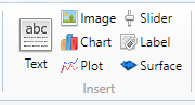
| 1 | Deletes the box | ||
| 2 | Sends the chart box to the background | ||
| 3 | Displays the chart box in front | ||
| 4 | Anchored the position of Chartbox with another box | ||
| 5 | Displays the charts in a separate window. | ||
| 6 | Save the chart to file | ||
| 7 | Send the chart to the printer | ||
| 8 | Copy the chart on clipboard | ||
| 9 | Display line chart | ||
| 10 | Display column chart | ||
| 11 | Display pie chart | ||
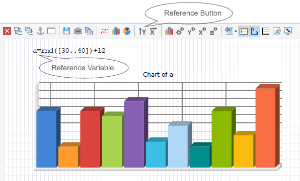
| 12 | First click the reference button, the click the reference variable on the worksheet. | ||
| 13 | Paste the selected variable as X-axis reference. The procedure is identical with the procedure in paragraph 10 above. The first and the last value determine the X-axis scale. [5,20] is equal to [5,10,15,20] | ||
| 14 | Opens a dialog to change the chart type | ||
| 15 | Opens a dialog to change chart options | ||
| 16 | Opens a dialog to change y-axis properties | ||
| 17 | Opens a dialog to change x-axes properties | ||
| 18 | Opens a dialog to change legend properties | ||
| 19 | Change the chart box background | ||
| 20 | Show or hide the legend | ||
| 21 | Show or hide the axes | ||
| 22 | Show or hide the grid | ||
| 23 | Show or hide datapoint labels | ||
| 24 | Display the chart area in 3D design | ||
| See also: Chart Typ, Chart Legend, Chart X-Axes, Chart Y-Axes, Chart Options | |||
Other graphics and design
| Charts | Displays results graphically |
| Chart types | Choose the chart type |
| Chart legend | Change the chart legend |
| Chart x-axis | Change chart x-axis settings |
| Chart y-axis | Change chart y-axis settings |
| Chart options | Change the chart options |
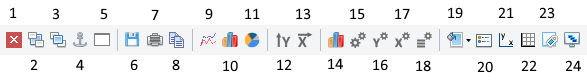
| Text | Insert text or a text file in a text box |
| Image | Insert images from clipboard or files |
| Slider | Insert a slider as a variable |
| Label | Insert label in chart oder image |
| Plot | Insert a plot box |
| Tables | Display of tables |
| Print the worksheet |
|
|